Each year’s web design trends promise to beam us into the scifi future of our dreams, given that they are based in technology. But the 2021 predictions we received from our community of web designers from around the world suggest the opposite.
2021’s web design trends appear to share a common theme: rather than aspiring to hi-tech fantasy, web designers are seeking new heights of realism. They are blending the digital and the ordinary like never before, and it reflects just how much a part of everyday life websites have become. In this way, the following 9 web design trends for 2021 are literally breathing life into the digital world.
9 web design trends that will be huge in 2021 — Parallax animation Neumorphism Abstract art compositions Comfortable colors Web design for causes Scrolling transformations Digital interpretations of physical products Interactive questionnaires Three-dimensional colors
1. Parallax animation — 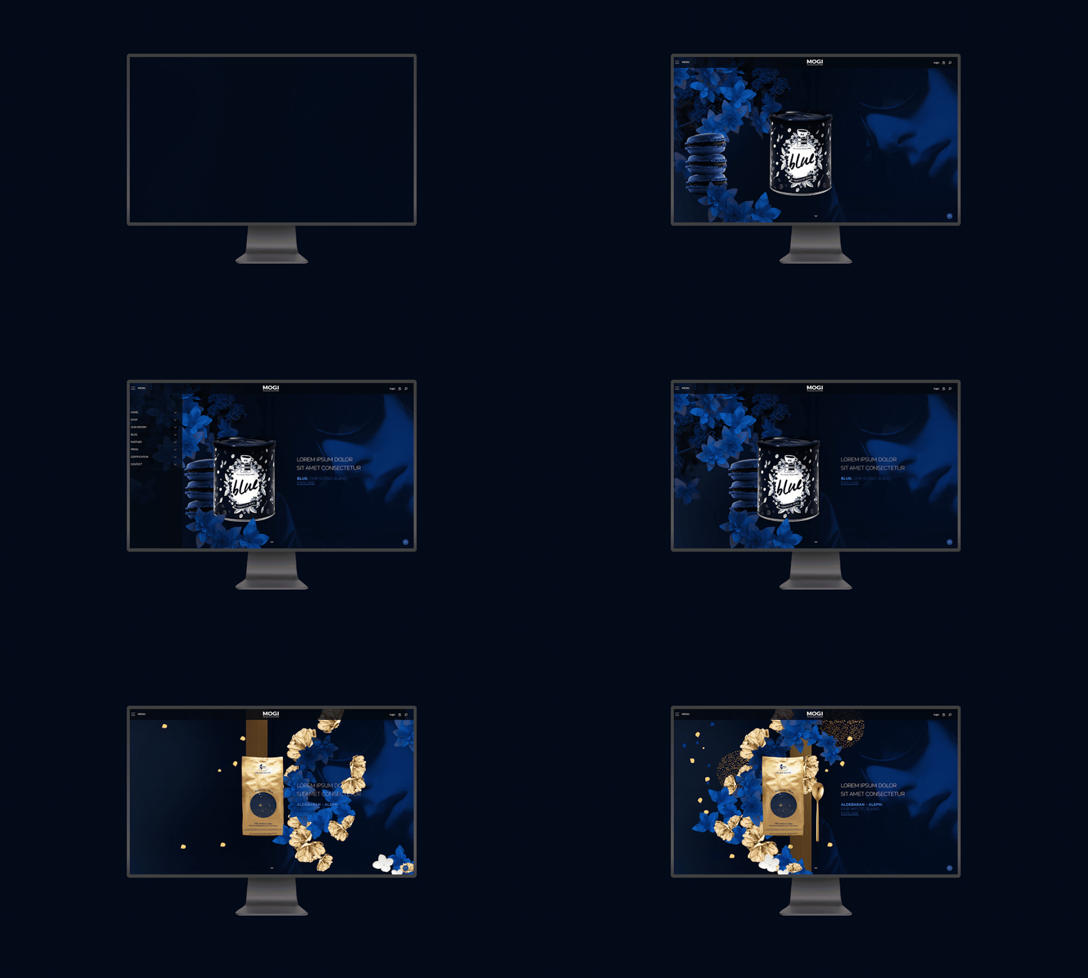 By Pinch Studio
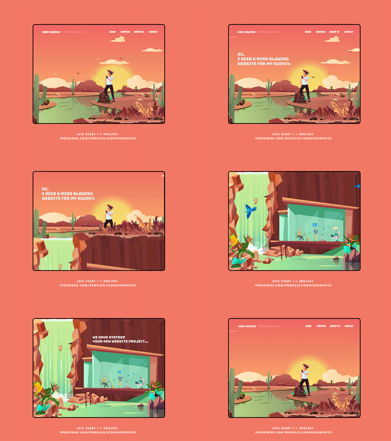
From micro interactions to particle backgrounds, we’ve witnessed the rising popularity of web-based animation trends year after year. 2021’s web animations are getting even more complex through the separation of page elements into foreground and background extremes, creating a parallax effect.
https://blog.99cluster.com/blog/wp-content/uploads/2020/11/Dribbble_2_1-4.mp4
By Minh Pham via Dribbble
https://blog.99cluster.com/blog/wp-content/uploads/2020/11/05-me-10mb-3.mp4
By Wesley van ‘t Hart via Dribbble
Parallax is the optical illusion that happens when objects near to the viewer appear to move faster than objects farther away. Although we see this in everyday life—when viewing passing scenery while driving, for instance—the effect on web pages comes across as equal parts real and surreal.
The depth created through the use of foreground and background also has the added benefit of immersion, transforming the computer screen into something closer to a theater stage. As users navigate the web page, they are drawn into its convincing performance as if by magic. And at the end of the day, isn’t magic what the internet is supposed to feel like?
https://blog.99cluster.com/blog/wp-content/uploads/2020/11/Collab-2-DВ.mp4
By UI8 via Dribbble
https://blog.99cluster.com/blog/wp-content/uploads/2020/11/dribbble_mockup_june_13__1_.mp4
By Slava Kornilov via Dribbble
https://blog.99cluster.com/blog/wp-content/uploads/2020/11/Tokyo-2.mp4
By Permadi Satria Dewanto via Dribbble
2. Neumorphism —
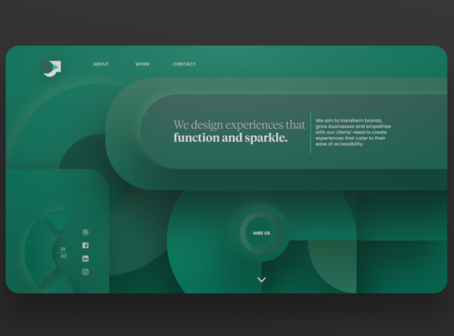
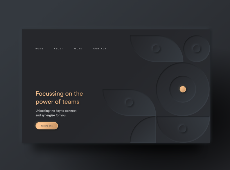
Neumorphism has been gaining incredible traction this past year, and in 2021 it promises to usher us into the paradoxical age of minimalist realism. The style is a successor to skeuomophism—a design approach that incorporates renderings of familiar, outdated materials into current designs, and it had its heyday on app icons everywhere in the early 2010s. This trend was largely supplanted by flat design, which simplified icons and colors in a way that was less realistic but more uniform and easily identifiable.
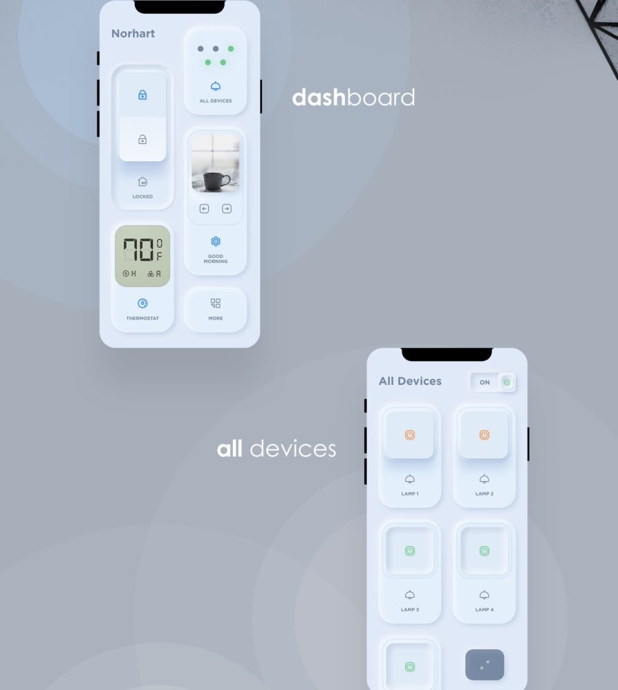
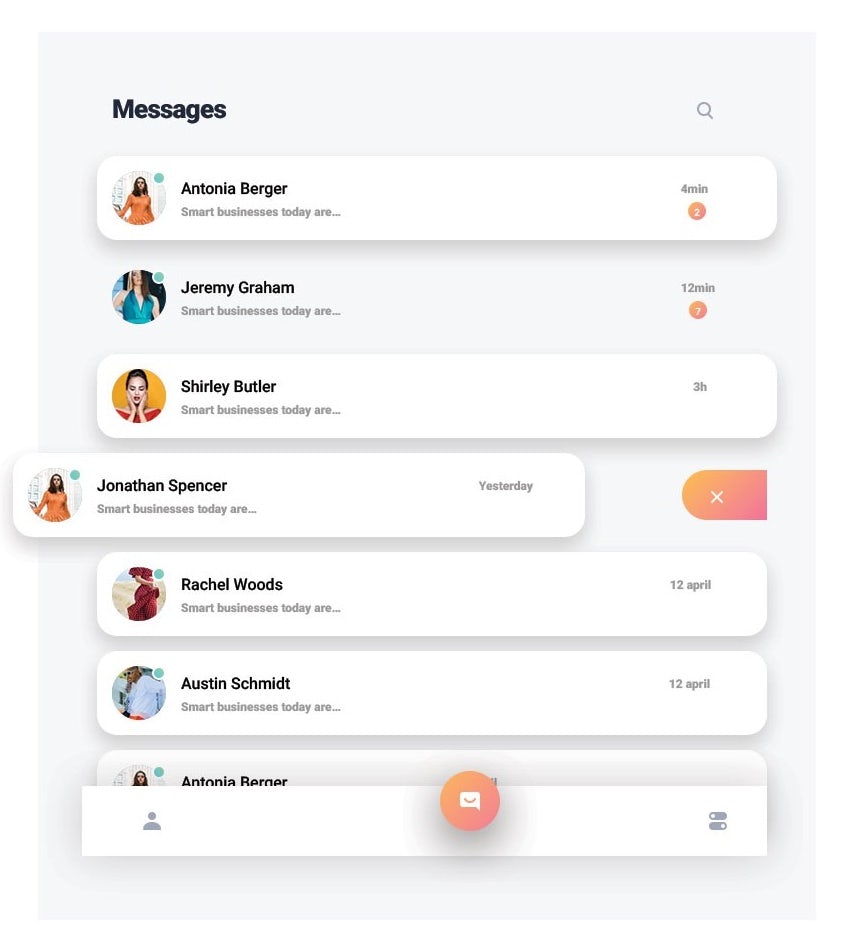
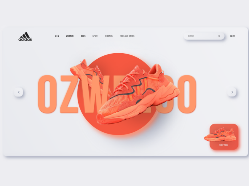
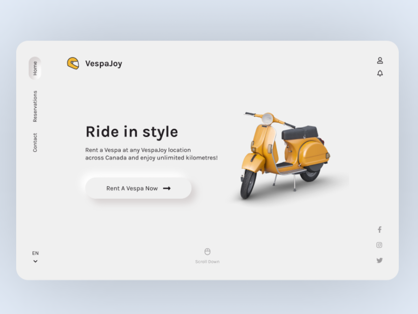
Neumorphism represents a merging of both trends, with designs that mimic physicality through selective drop shadows while being overlaid with semi-flat colors. Most commonly, the effect resembles digital embossing or debossing. It allows designers to reclaim the tactile experience that was lost in the flat design era, and this in turn heightens the user’s connection to the design he is interacting with. Expect to see this stylized realism on the buttons, search bars and text boxes all across the digital designs of 2021.
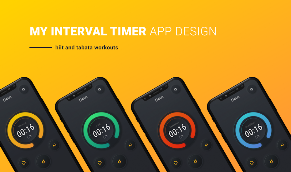 By ODarka
3. Abstract art compositions —
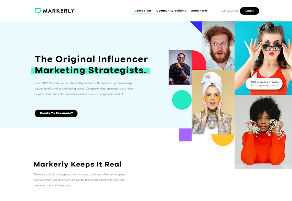
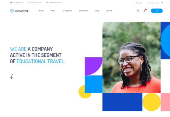
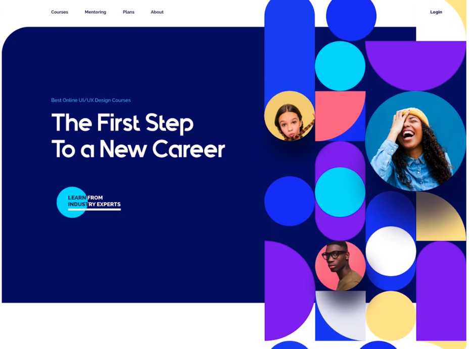
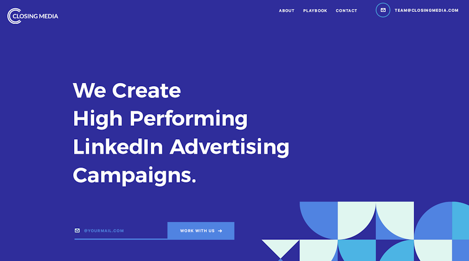
Abstract shapes, especially those consisting of geometric primitives like squares and circles, can come across as simple, minimalist and restrictive. However in 2021, web designers are incorporating them into complex, sprawling compositions that exude freedom.
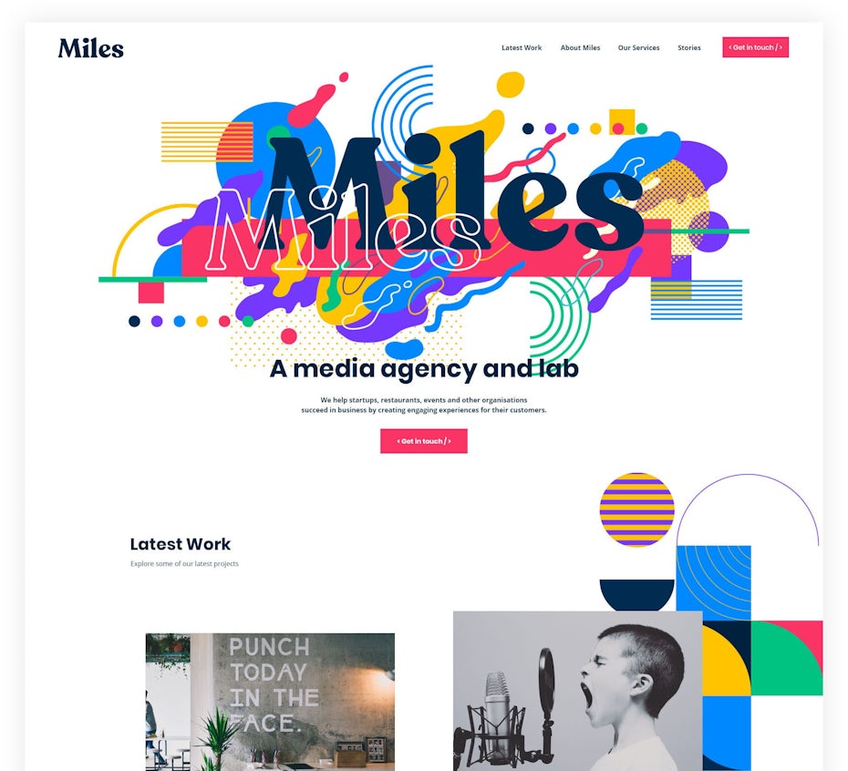 By andrei2709
In most cases, these abstract art arrangements are taking the place of stock photography and figure illustrations. While they can include images of people, they still evoke emotion without them. Their bursting, Pollock-esque compositions feel energetic, and their many vibrant colors are infectiously warm. The result is web pages that feel expressive and alive, even in the absence of familiar human faces.
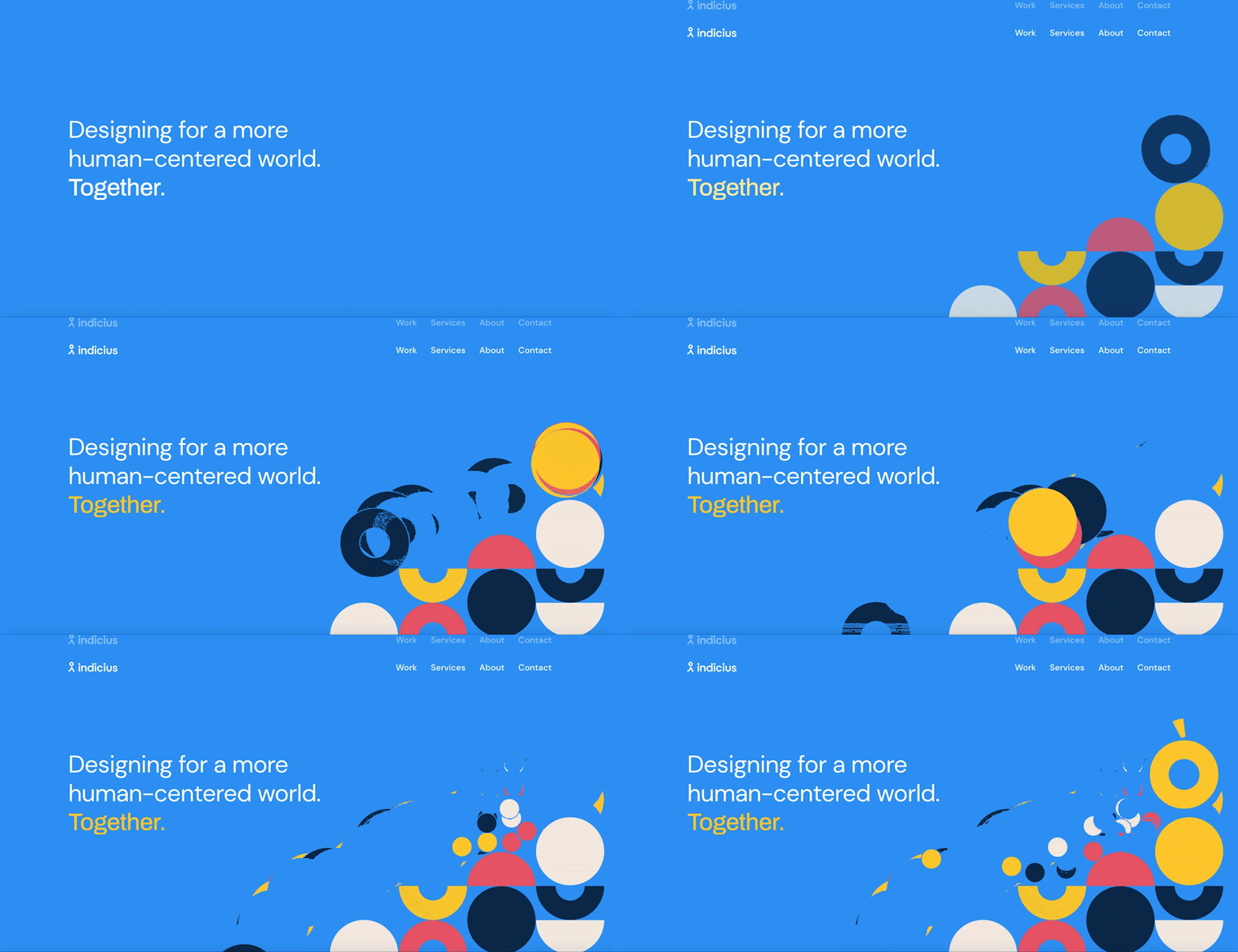 via indicius.com
4. Comfortable colors —
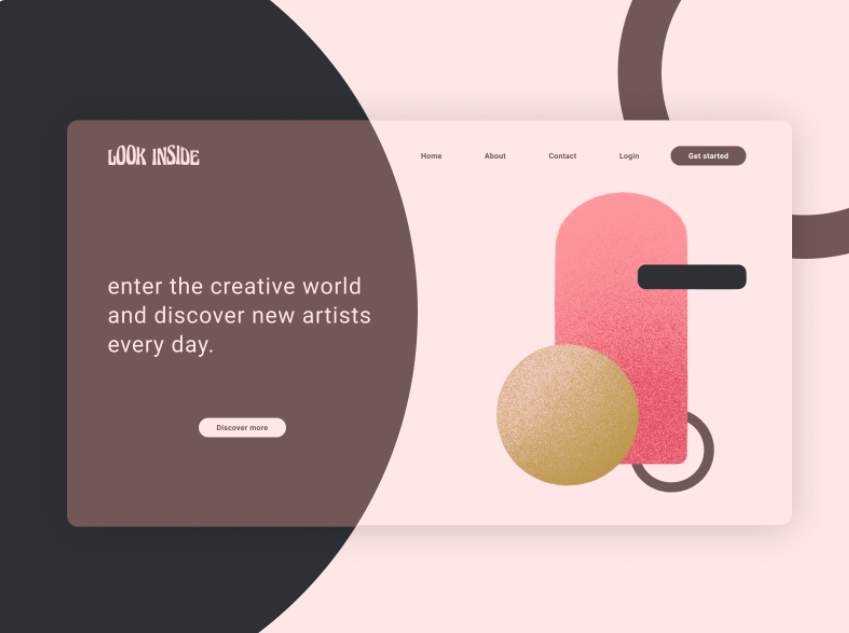
Given the increasingly digital nature of the job market these days, most people spend the majority of their time on computers. Because of this, it is not uncommon for users to experience eye strain after staring at screens for long periods of time. Web designers have been taking this into account with color schemes that are focused on being easier on the eyes.
This somewhat explains the popularity of last year’s dark mode trend, which counteracted the overwhelming whiteness that dominates screen-based media.
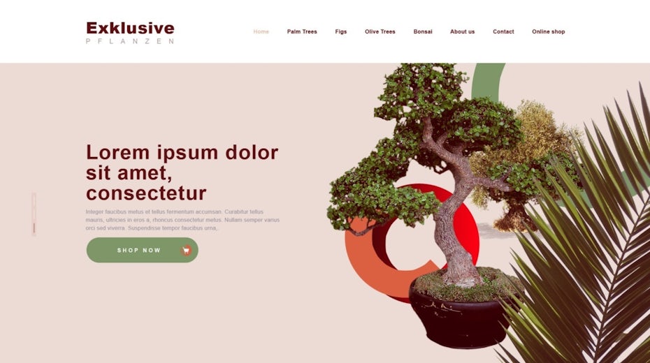
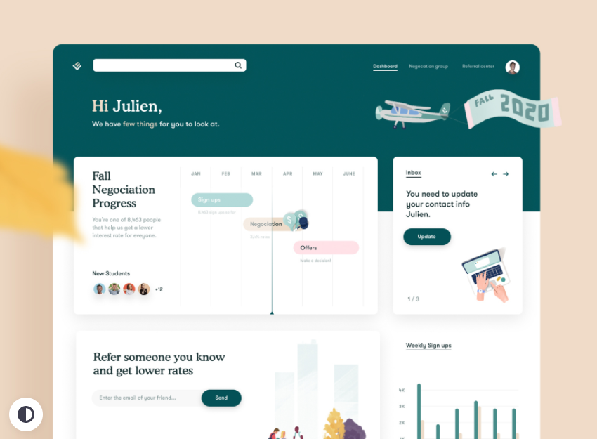
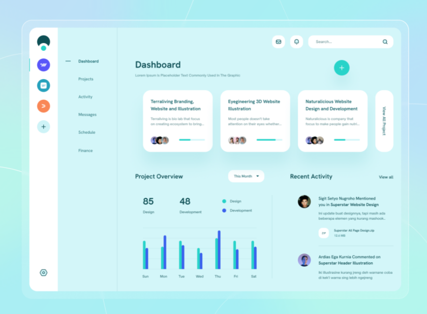
In 2021, web designers will be thinking outside the two extremes of dark and light. They are finding middle ground in soft color palettes, like wholesome greens, pastel blues, warm browns or light pinks. These not only make website colors less jarring than pure black or pure white, they naturally induce calm and relaxation.
This trend overall is a hopeful sign that web designers of the future may be more concerned with accessibility and comfort than dramatic innovation.
 By Viola via Dribbble
5. Web design for causes —
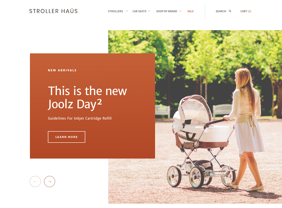
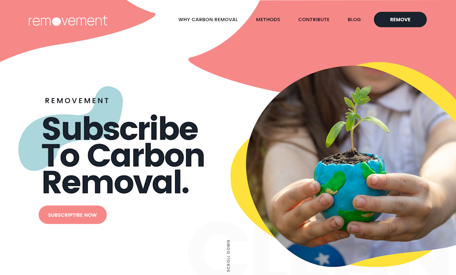
With the COVID-19 pandemic and the various shelter-in-place orders that followed, the internet has become a refuge. Not only have virtual conferences become the norm for social gatherings and entertainment, many brick-and-mortar brands have turned to websites to keep their businesses afloat. And web designers were up to the task, creating meaningful and impactful designs.
 By DesignExcellence https://blog.99cluster.com/blog/wp-content/uploads/2020/11/Coral.mp4
By Arthur Mineev via Dribbble
In 2021, we will see web designers continue to value their role in helping the world through troubled times.
What this means is brands focusing their web designs around their virtues, such as their sustainability efforts or community involvement. It means brands getting onboard with stock photos that reflect real, diverse customers. It means a rise in digital spaces bringing awareness to social causes through interactive means, such as visualizations and simulations. And it means an increase in the resources and methods of DIY web design, making website production accessible to everyone.
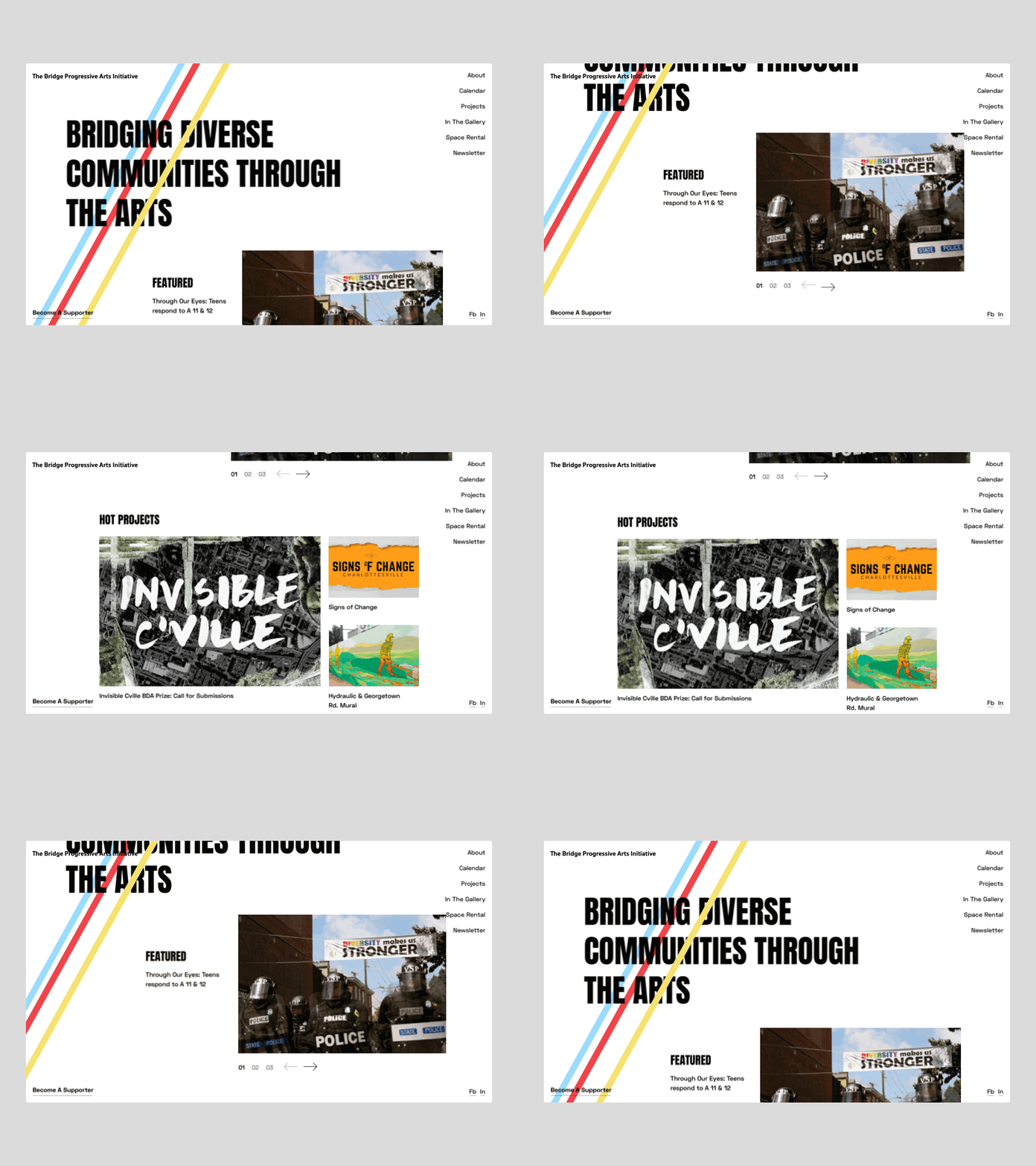 By Lance Barrera via Dribbble
 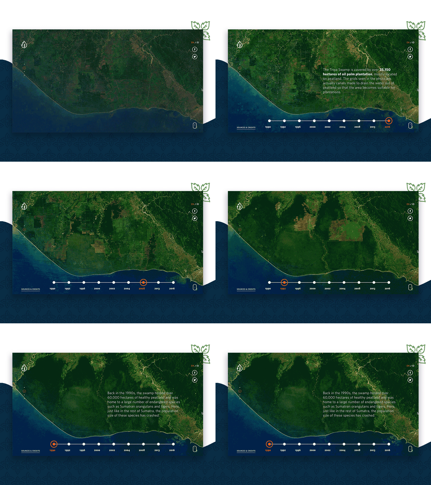 By SixtyTwo via Dribbble
Web design has long been focused on delivering great user experiences. And in 2021, the best user experience will stem from shared values and joint causes.
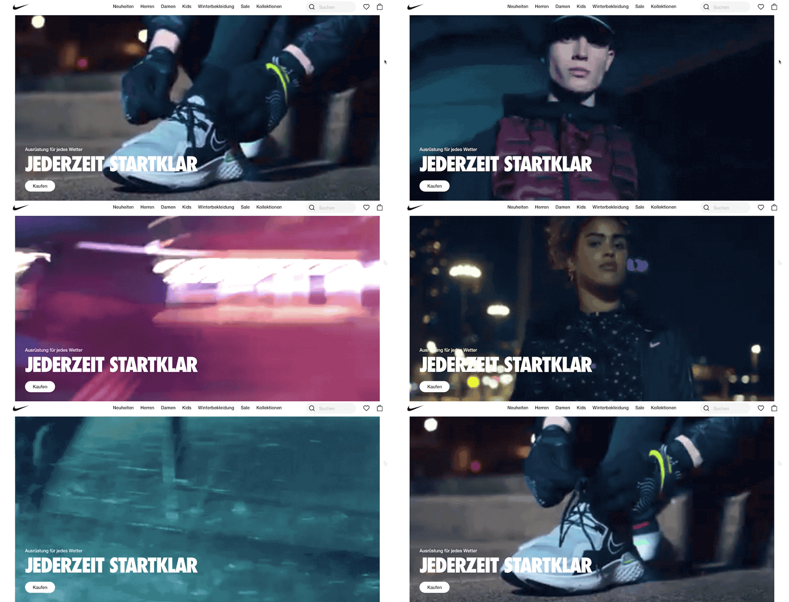 via Nike
6. Scrolling transformations —
When users scroll, they are doing more than navigating the page: they’re interacting. The physical actions they perform in real life—flicking their fingers over the mouse—cause a response on the screen. Interaction is a form of participation, and when users are involved in things that are happening, they are more likely to be interested and engaged.
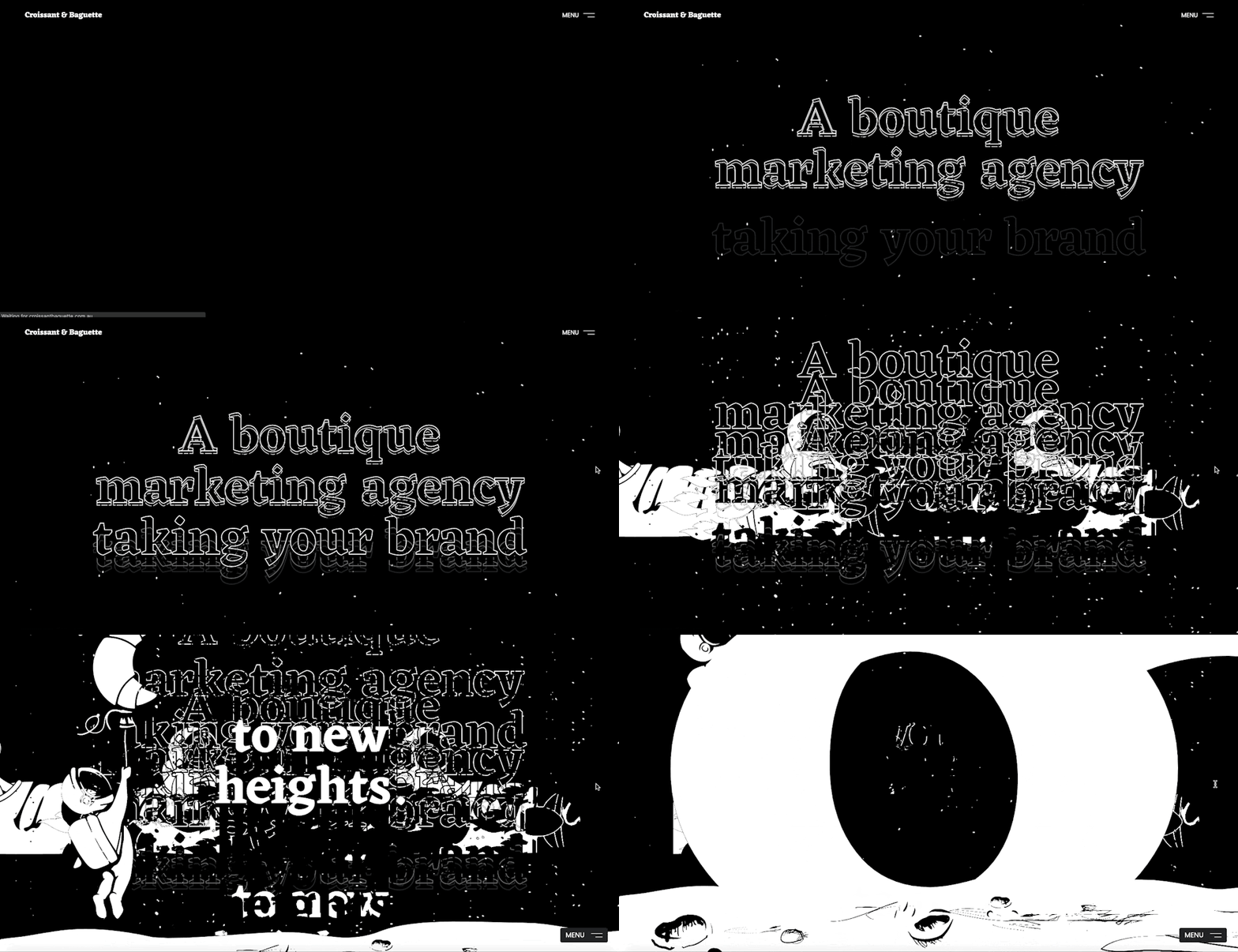 By Hiroshy


 https://blog.99cluster.com/blog/wp-content/uploads/2020/11/2.mp4
By JP via Dribbble
https://blog.99cluster.com/blog/wp-content/uploads/2020/11/dribbble_mockup_june_10.mp4
By Slava Kornilov via Dribbble
https://blog.99cluster.com/blog/wp-content/uploads/2020/11/hello_world_scrolling.mp4
By Vilius Vaicius via Dribbble
Scrolling is one of the most subtle forms of interaction, and as such, 2021’s web designers are ramping up the visual feedback users get when they scroll. This can range from full color scheme changes to complex animated transitions to wholesale shifts in the layout. All in all, web designers are taking the time making each scroll feel like a new page—sometimes even a new website.
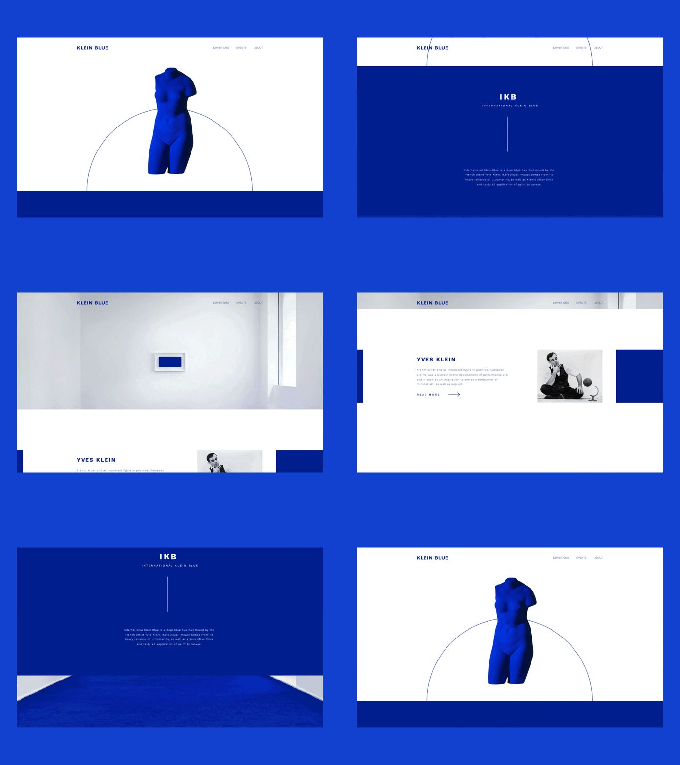 By outer via Dribbble https://blog.99cluster.com/blog/wp-content/uploads/2020/11/d5c39e460e887391144accca85c5436d.mp4
By Manon Jouet via Dribbble
7. Digital interpretations of physical products —
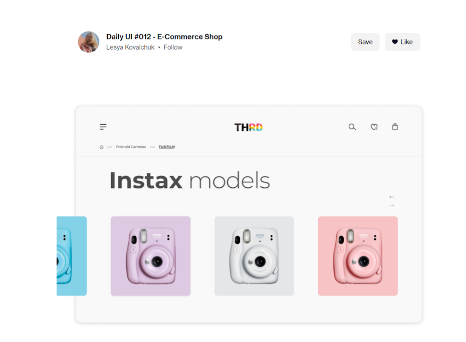
Products are often at the heart of websites, and 2021’s web pages have their hearts on their sleeves. Specifically, products are inspiring literal design elements through creative, digital interpretations of physical media.
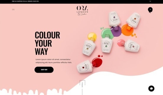
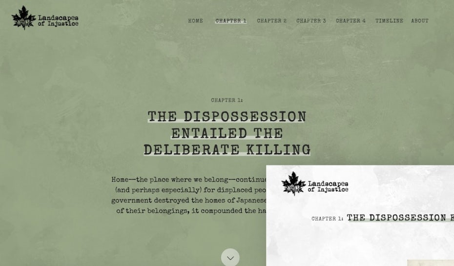
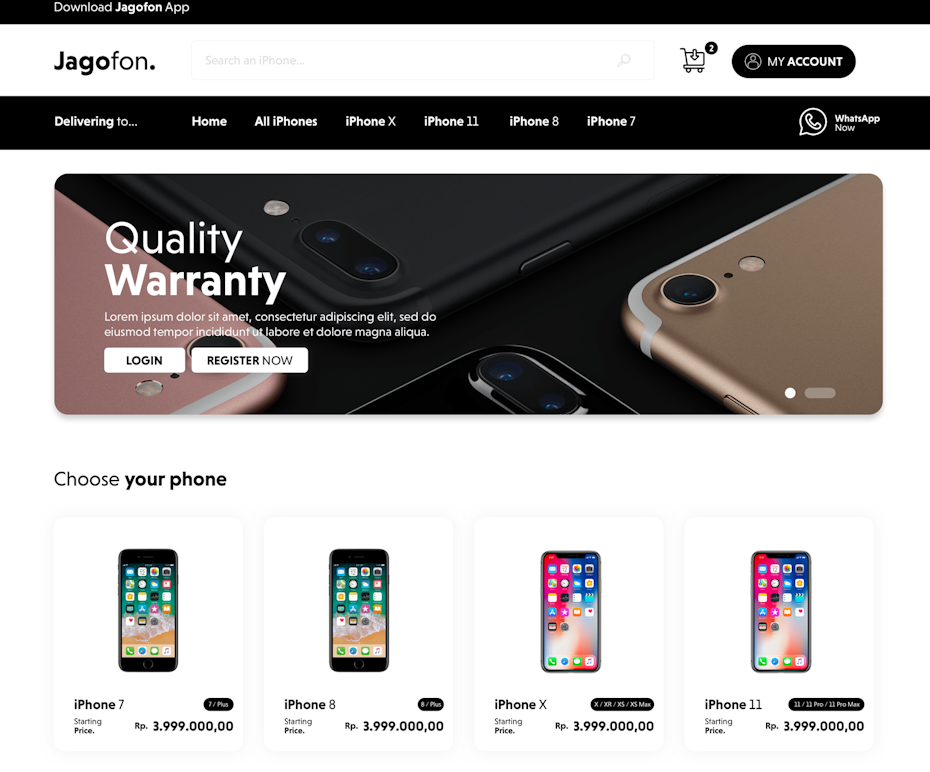
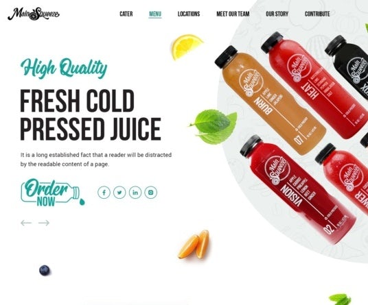
This might come in the form of color smeared across a page like nail polish or images that are cropped in rounded rectangles like smart phones. Not only does this approach create visual synergy between the product and its website, it makes web pages feel more organic and unexpected. With websites becoming an increasingly common part of everyday life, this trend of blending the real world and the digital feels like it was made for our moment in time.
8. Interactive questionnaires —
The onboarding process—the window of time in which a user visits a landing page—is perhaps the most critical moment of a user’s journey. They stand on a knife’s edge between intrigue and apathy, and the quality of his experience here will send them toppling firmly to one side.
https://blog.99cluster.com/blog/wp-content/uploads/2020/11/madklubben-smagsfinder-2.0.mp4
By Christian Werther via Dribbble
Rather than having the user read product descriptions and make decisions on their own, more and more brands are using questionnaires to foster an interactive experience. These quizzes ask personable multiple-choice questions that are focused on the visitors’ likes and dislikes in order to subtly cater products to them.
https://blog.99cluster.com/blog/wp-content/uploads/2020/11/fasting-quiz.mp4
By Florian Pollet via Dribbble
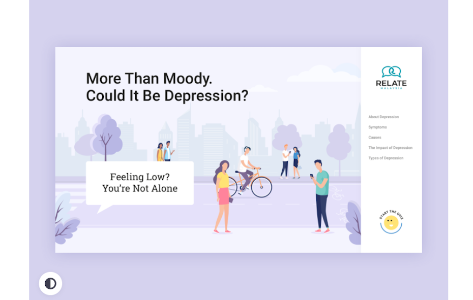 By Alena Sokolova via Dribbble
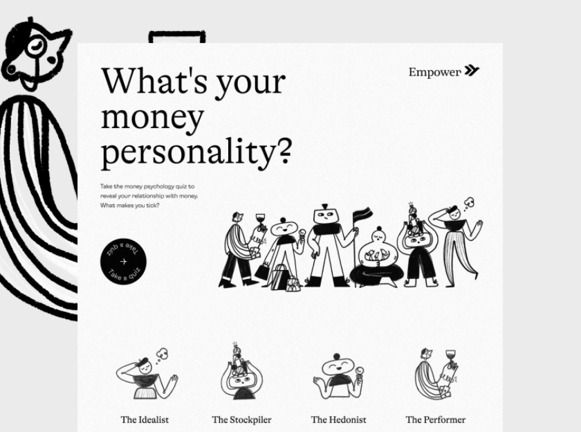
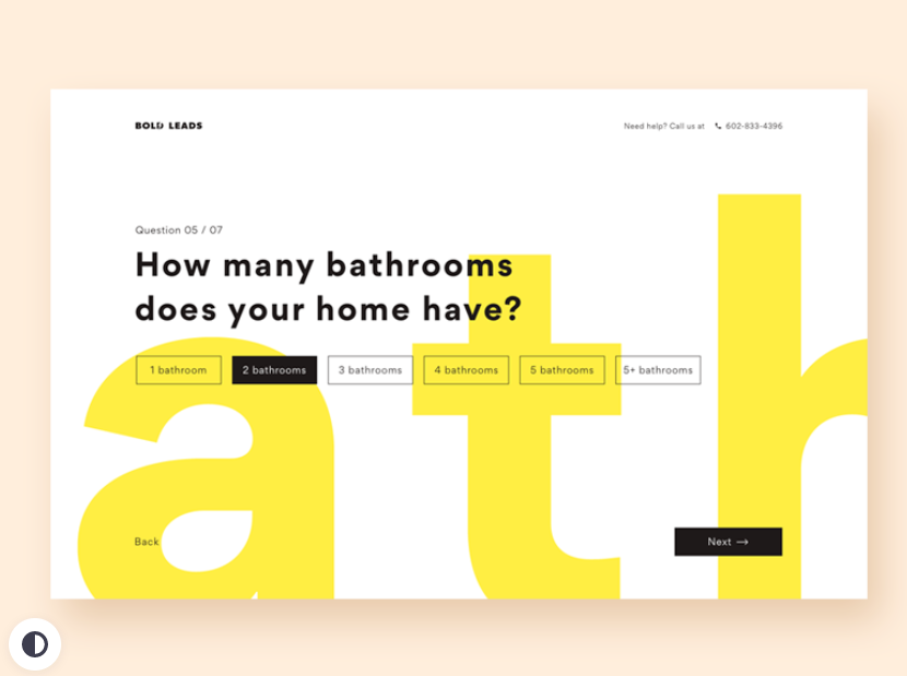
From a design standpoint, this means landing pages that are more like a series of cards with animated transitions in between them than standard web pages. This also makes them much more interactive than the survey fields commonly included in the headers of landing pages.
Given how effectively these get-to-know-you quizzes make the prospective buyer feel like they are already a part of the service before they’ve even signed up, we expect to see onboarding questionnaires become a standard feature of web design in 2021.
9. Three-dimensional colors —
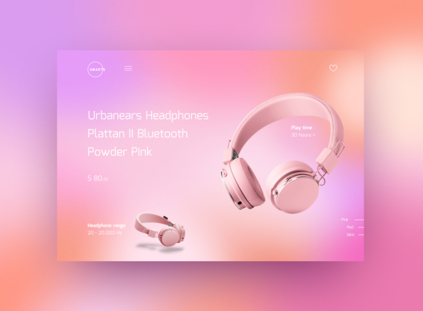
Color schemes in web design have been trending towards gradients for a while now, and this year’s trend feels like the next evolution, with color transitions becoming more lifelike than ever. Taking their cue from Apple’s upcoming Big Sur OS, we expect colors that are saturated and three-dimensional, almost like fruit you can pluck right out of the screen.
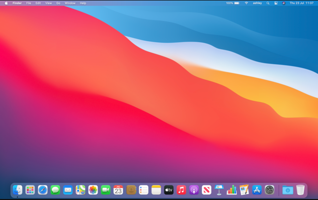 Big Sur OS via Apple
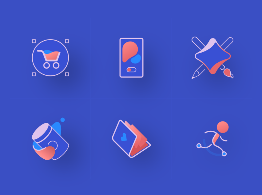
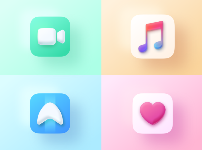
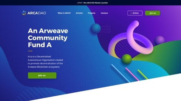
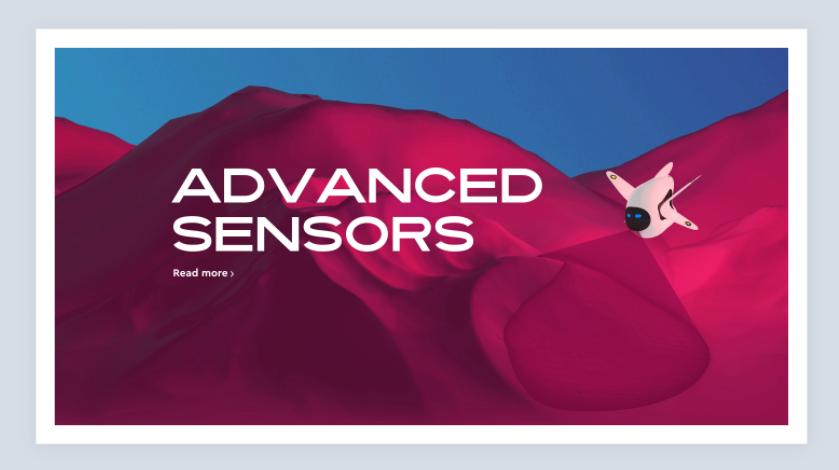
This trend is accomplished through fine shading that gives a rounded feel to the flat icons of yesteryear. While we do anticipate it to appear most commonly on app icons, web designers are also abandoning the neat transitions of gradients for background blended colors that come across as more imperfect and natural. Two colors side by side might abruptly smear together or they may retain the shadows and depth of painted objects. All in all, this trend suggests that the web design colors of 2021 are aspiring to higher realms of realism.
 Ready for the biggest 2021 web design trends? —
At the end of the day, the top 2021 web design trends look less like design out of a sci-fi movie and more like actual design we would encounter in everyday life. It goes to show how increasingly common websites are as a part of our life, and the designers of 2021 are bringing them down to earth. How do you imagine the future of web design trends? Let us know your predictions in the comments below.
The post 9 stunning web design trends for 2021 appeared first on 99designs.
Read more: 99designs.com
 By
By 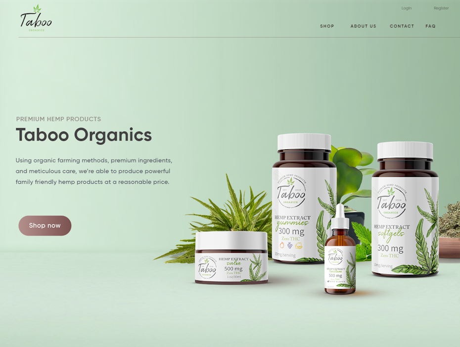 By
By 